
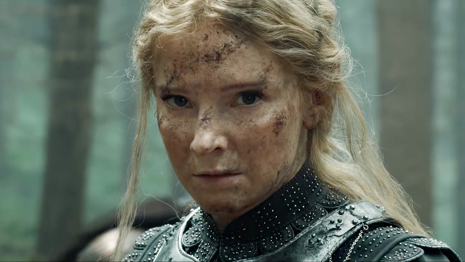
As viewers make their long-awaited return to Middle-earth in Season 3 of “The Lord of the Rings: The Rings of Power,” they will inevitably find things a bit different compared to where they last left off. The war that was teased at the conclusion of Season 2 has finally arrived, led by Charlie Vickers’ Sauron unmasked in all his Dark Lord, uh, lordliness. A five-year time jump has reset the board considerably, putting heroes like Elrond (Robert Aramayo) and Galadriel (Morfydd Clark) on their back foot. But, as of Episode 2, fans will notice a significant tweak has been made to the opening credits sequence — one which contains an unseen connection to another popular streaming series.
Prior to the premiere, I recently attended the press junket for “The Rings of Power” and spoke with co-showrunner Patrick McKay about the third season. In our limited time together, I wanted to address the noticeably darker edge to the title sequence this time around and whether there might be any Easter eggs worth paying attention to, as has been the case in the prior two seasons. The creative team worked with studio and creative consultant Plains of Yonder, who crafted the sand-based vibrational look for the opening credits of “The Rings of Power” and apparently pitched a new approach for Season 3. Here’s a behind-the-scenes featurette showcasing their previous work:
But observant fans may recognize the fingerprints of another haunting title sequence. Fans of HBO’s “White Lotus,” this one’s for you. As proudly displayed on their website, Plains of Yonder was also involved in everyone’s favorite dramedy about “when everybody goes to the hotel” (as McKay hilariously put it in our interview) and, specifically, the wallpaper-focused title sequence with some seriously unsettling imagery. Not surprisingly, the designers pulled a similar trick with “The Rings of Power.”
The Rings of Power Season 3’s title sequence is darker, more evocative, and less reliant on references
In keeping with the theme of Season 3 of “The Rings of Power,” Patrick McKay explained that Plains of Yonder pitched a different approach for the episodes to come. Where Seasons 1 and 2 contained hidden references and symbols pointing towards specific events of the story, the designers felt called to go in another direction. “They’re really serious artists,” McKay told me with obvious admiration for their skills. “They’re really wonderful people to work with. I mean, we find (their work on Season 2) hypnotic.”
Episode 2 provides our first glimpse of the newly-revamped opening credits sequence, with the familiar-looking particulates now taking on a much darker color palette as they reform into all sorts of different visuals: evocative landscapes, elemental imagery, and plenty more examples of abstract art. According to McKay:
“Season 3, they’re like, ‘We want to do something different. We want to change the entire thing. We want to revisit the concept and make it feel like this season feels (emotionally), rather than reference things that happen in the season.’ So it’s a little different this time. It’s a little more dramatic, has a little more darkness to it.”
The visuals certainly help strike a different tone for Season 3, although the stirring musical theme by “The Lord of the Rings” trilogy composer Howard Shore remains perfectly intact. This seems to suggest that, even in its darkest moments, Middle-earth always retains a glimmer of hope. New episodes of “The Rings of Power” stream on Prime Video every Wednesday.





Leave a Reply